Next Arrivals Feature
Timeline
June-July 2022
My Role
UX Designer, UI Designer, UX Writer
Tools
Figma, Miro
UX Design, Responsive Design, User Stories, User Flows, Proto-Personas, Ideation, Wireframing & Prototyping, UI Design, Visual Design, Moodboards, Typography, Color Theory, Style Guides, Illustration, Animation, Interaction Design, UX Writing
Skills
Context
The Washington Metro Area Transit Authority (WMATA) runs the public transit system throughout the Washington, DC, metropolitan area. Pre-pandemic, WMATA’s metro and bus services transported ~975,000 riders per day. As of May 2022, daily ridership numbers around 350,000 and will likely increase as people return to work, travel, and play.
Project
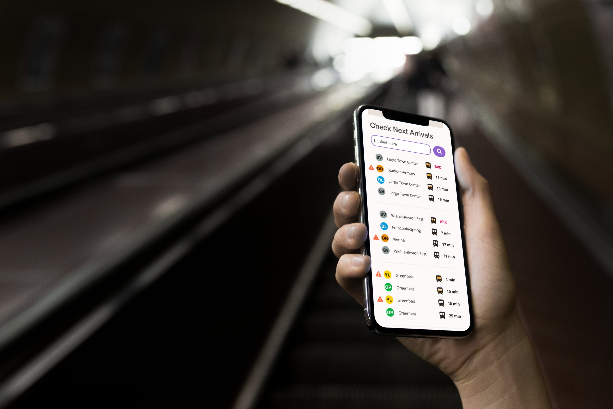
Currently, riders can check metro and bus arrival times on WMATA’s web app, but the UI design leaves something to be desired. Riders need a product that is more visually appealing, shows users where they are in relation to stations and stops, and presents metro and bus information side-by-side. I redesigned* WMATA’s Next Arrivals feature to meet these needs, and ultimately provide a more usable and delightful experience.
*This was an independent redesign project conducted with no association to WMATA.

01
Tweak the UX
02
Wireframe
03
Develop the visual style
04
Finalize the UX
05
Final product
01
Tweak the UX

Evaluating the existing design

- The user flow is simple and intuitive
- The orderly list design of the incoming arrivals screen is visually appealing and readible

- The Next Arrivals feature is neither highlighted nor easily findable on WMATA's homepage
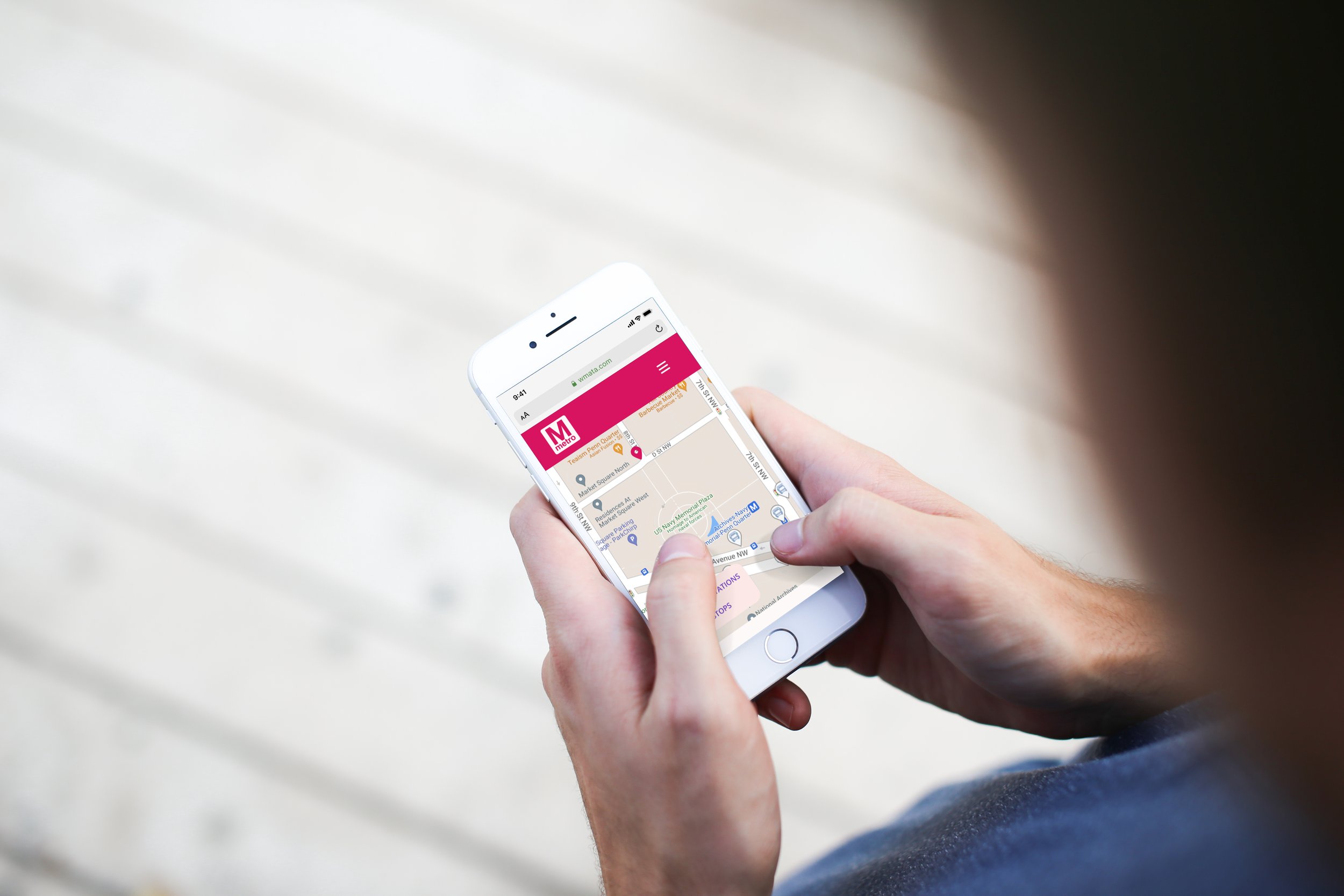
- Location services identify nearby stations/stops, but they do not appear on a map feature for users who aren't oriented or familiar with the area
- Users cannot view metro and bus information side-by-side
- The incoming arrivals screen either opens in a separate pop-up window or to a completely new webpage (buseta.wmata.com)
- The tablet and desktop versions of the incoming arrivals screen do not use appropriate grid layouts
- The overall visual design lacks energy and a standout brand identity
User stories to focus the scope and goals
“As a WMATA metro/bus rider, I want to be able to quickly check next arrivals at any station/stop.”
“As a WMATA metro/bus rider, I want to be able to see metro and bus information side-by-side so that I can check the most efficient route for my trip. ”
“As a WMATA metro/bus rider, I want to see any service alerts that might impact my trip.”
“As a tourist, I want to be able to find locations of the nearest stations/stops in relation to me.”
“As a WMATA metro/bus rider, I want to know that I am getting accurate information from the real source, not a third-party app. ”
“As a commuter, I want to be able to see train/bus capacity during rush hour.”
- Homepage with easily findable Next Arrivals feature
- Search feature to see next arrivals by station/stop
- Map feature that shows distance of nearest stations/stops, with integration to see metro and bus side-by-side
- Icons indicating train capacity
- Service alerts for construction, delays, etc.
- Branding must discern this as the official app, to compete with third-party competitors
Functional requirements
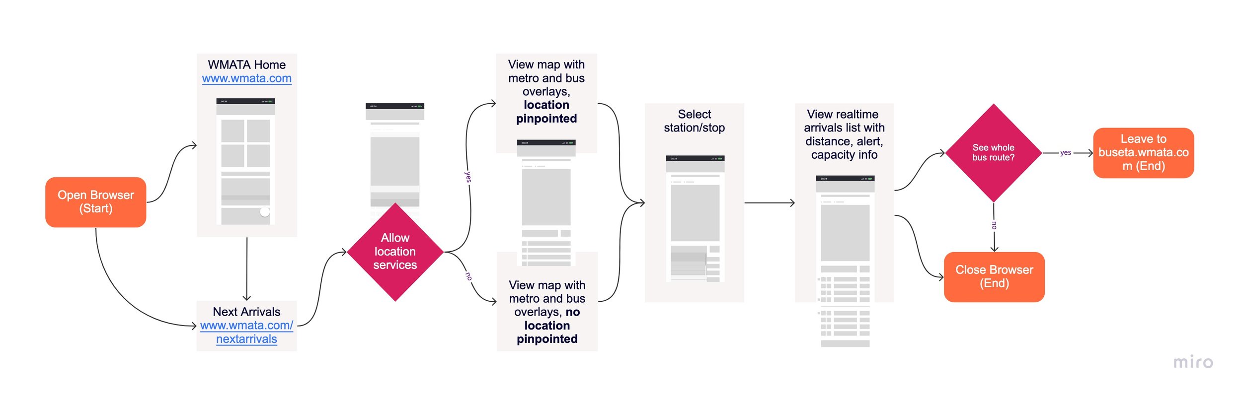
User flow
Proto-Personas


02
Wireframe

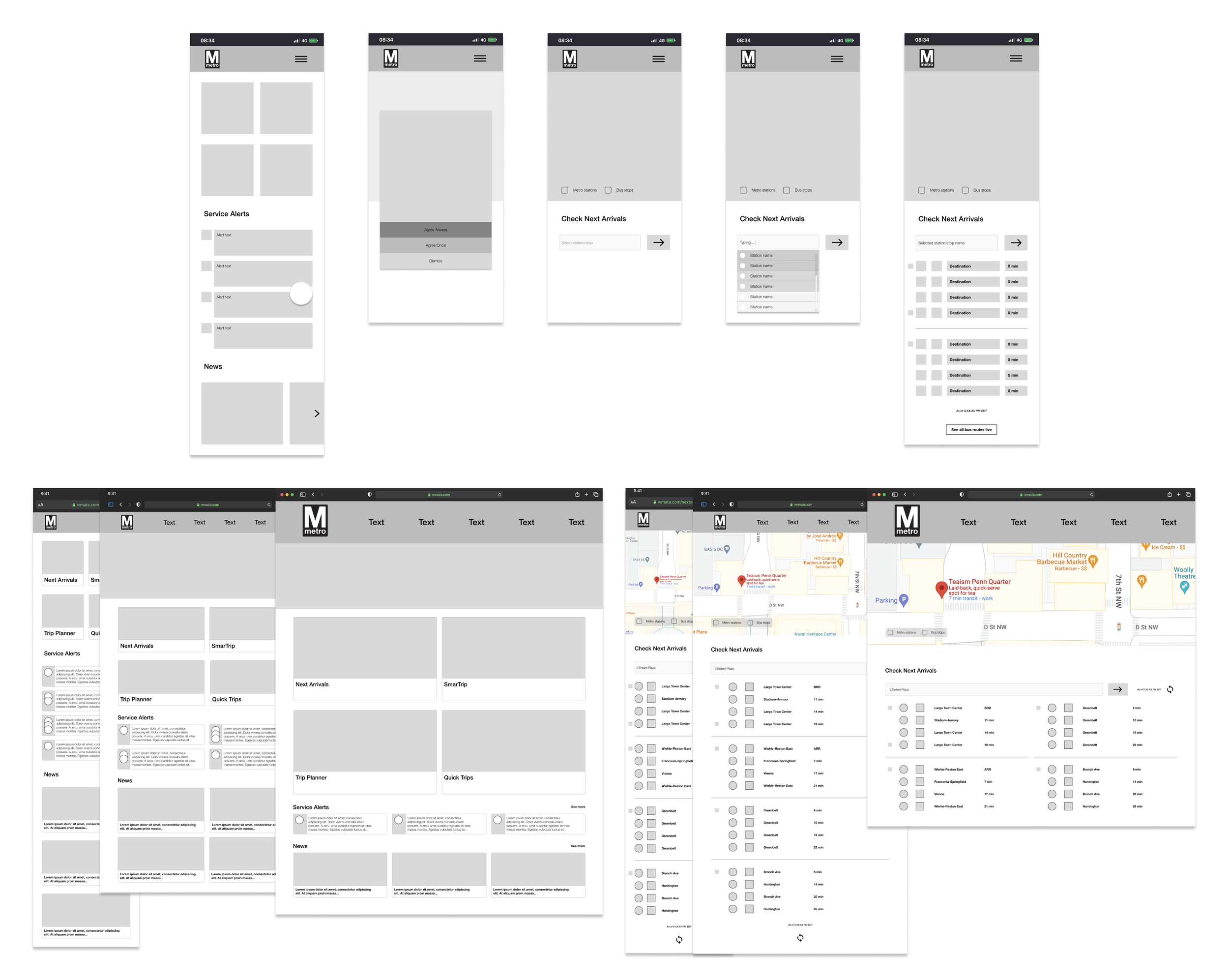
Low-fis

Mid-fis
03
Develop the visual style
Moodboards for two visual design options


Ultimately, I selected Retro Metro
This option allows me to pull elements of DC’s rich art and architecture into the design. It also markets DC to a wider audience of visitors/tourists that the city might want to bring in to raise ridership to pre-pandemic levels.
Color scheme options inspired by the culture, architecture, and history of Washington, DC


The challenge was to select a color scheme that was at once nostalgic and timeless, and that would provide significant contrast for readability.
I selected the Washington Color School option because:
- The palette is the most visually cohesive.
- The saturated colors provide strong contrast.
- Several of the colors are part of WMATA’s existing brand, so it provides an opportunity to re-imagine how they could be applied to the UI and brand.
- Other elements of Washington Color School art, such as geometric shapes and line patterns, can be pulled into the visual design.
- The time period of the art movement coincides with the retro 1970s look from my moodboard.
- The famously Washingtonian art movement makes WMATA’s brand more unique and place-based.


04
Finalize the UI

Style guide of colors, typography, logos, imagery, iconography, elements, and grids
Custom illustrations and animations
These were inspired by the geometric shapes and line patterns of Washington Color School art, as well as the arrival indicator lights in metro stations.


Mobile, tablet, and desktop breakpoints

Interaction and gesture annotations

05
Final product

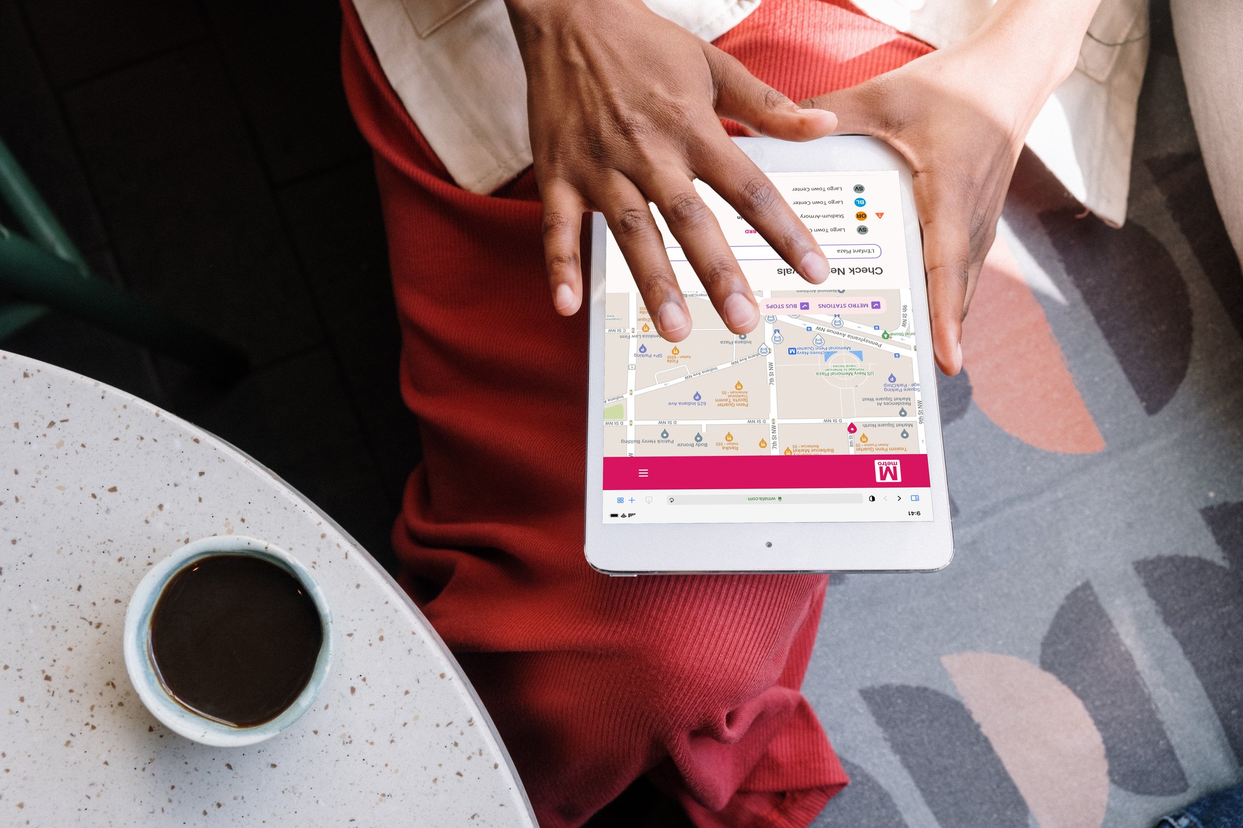
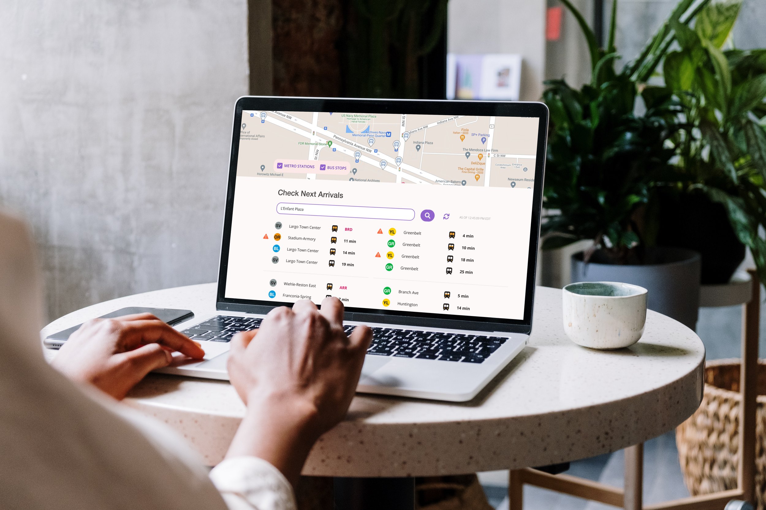
My redesign of WMATA’s Next Arrivals feature maintains the basic functionality currently available but takes the design to a new level.
With a unique, energetic visual design that draws on the color, art, and culture of the area; location services that improve the product’s usability on-the-go; and the ability to view metro and bus info side-by-side and without pop-up windows, the Next Arrivals feature is markedly more usable and delightful.
What did I learn?
Draw on established design patterns, UI kits, and icon libraries to create familiar and intuitive user experiences
Color application should be strategic, not everything needs to be colored
Work closely with developers so that UI elements have the right specs for hand-off
What’s next?
Test the design with metro and bus users
Consider the design and content of WMATA’s website as a whole, including other features like Trip Planner, SmarTrip, and Quick Trips that can be used in conjunction with Next Arrivals