Macaw Digital Wallet
Timeline
November 2021-May 2022
Tools
Figma, Adobe XD, Google Forms, Google Drawings, UsabilityHub, Optimal Workshop
My Role
UX Researcher, UX Designer, UI Designer, UX Writer
Design Thinking, UX Research, Competitive Analysis, SWOT Analysis, User Stories, Interviews, Surveys, Personas, User Flows & Task Analysis, Journey Maps, Information Architecture, Mobile-First, Site Maps, Card Sorting, Rapid Prototyping, Wireframing & Prototyping, Usability Testing, Affinity Mapping, Rainbow Spreadsheets, Preference Tests, Visual Design, UI Design, Illustration Style Guides, Design Language Systems, UX Writing, Microcopy
Skills
Context
The rise of digital wallets—Venmo, Cash App, PayPal, ApplePay—has reshaped the world of buying and selling. As part of my UX Design bootcamp, I was tasked with designing a digital wallet in the form of a mobile-first responsive web app. But with such titan competitors on the market, I wanted to create something new in the fintech space.
Project
I set out to harness digital wallets for the greater good. For this project, I designed an app that provides users with a solution to charitable giving in the form of a digital wallet, to help them achieve their charitable giving goals while completing daily financial transactions.

01
Explore digital wallets
02
Understand needs, goals, motivations
03
Empathize with users
04
Map the app
05
Validate with users
06
Refine the design
07
Final product
01
Explore digital wallets
I began exploring my idea for a new kind of digital wallet by writing a problem statement
“Digital wallet users need a way to easily, quickly, and securely look up and make charitable contributions because they want to support their favorite nonprofits with the least amount of effort and hassle. We will know this to be true when we see an increase in charitable contributions from individuals made via Macaw digital wallet.”
I conducted competitive and S.W.O.T. analyses to understand how digital wallets and charitable giving already interact

Direct competitors: other digital wallets; Indirect competitors: digital fundraising tools for nonprofits; Replacement competitors: traditional giving methods (i.e., check)
I analyzed PayPal, a direct competitor, and Give Lively, an indirect competitor. I learned that the market is oversaturated with digital wallet that offer charitable giving subfeatures, but none of them offer an experience wholly focused on charitable giving.

I wrote user stories and made a list of functional requirements as a starting place for ideation
Login / Sign up flow, enabled with 2-factor authentication
Onboarding quiz to set personal giving goals
Dashboard to measure personal giving goals
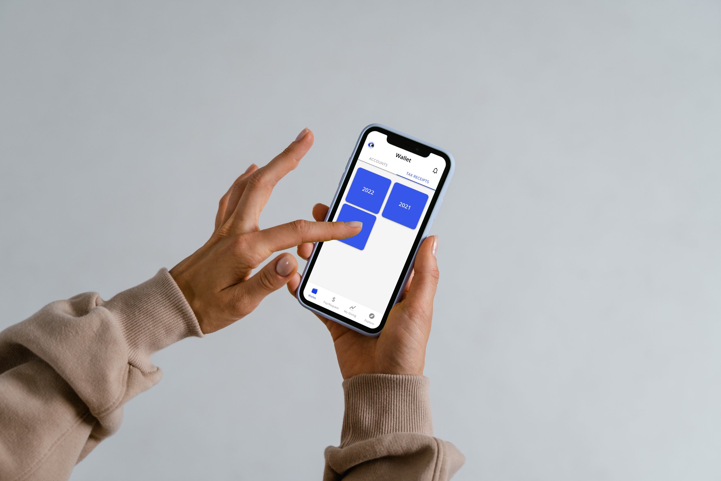
Saved tax information (tax receipts, list of all donations by tax year)
Feed of stewardship updates shared by user’s charities
Money transfer function to donate via credit card, debit card, ACH transfer, crypto, enabled with 2-factor authentication
QR function to donate on the go
Options to give in memory/honor, give gift memberships, and send “giving gift cards”
Page to browse and favorite charities
Feed of giving opportunities
Blog of educational articles
Feature(s) to find, log, and share in-kind donations
Wallet where card and account info is stored
Settings menu (change permissions, log out, etc.)
Feature to host your own fundraiser and share to social media
02
Understand needs, goals, motivations
I set research goals to guide my inquiries into user needs, goals, and motivations
Identify users’ behaviors and attitudes about charitable giving - How often, when, and how do they make donations? What motivates or discourages them from doing so?
Document users’ opinions of existing digital wallets on the market
Collect data on the context in which users would use a digital wallet to make donations
Evaluate how important privacy and security are to users
Discern users’ feelings about gamification experiences

I surveyed 21 people and interviewed 4 more to learn more


My research led to insights about digital wallets, charitable giving, and motivation
I used these insights to refine the app’s scope
For example, I narrowed Macaw’s target demographic from 21 to 75 year olds to 18 to 55 year olds based on existing digital wallet behaviors
Younger users already use digital wallets on a regular basis
Older users do not use digital wallets
Older users prefer traditional donation methods like checks
Giving days aren’t widely popular, people like to give throughout the year if/when they can and want
Most people don’t take tax benefits, either because they don’t know how or their giving is too low for it to pay off
Most people who do not give to charity don't participate because they don’t have the means to, they prefer to give in other ways (volunteering, in-kind), or they do not know how to access charities to donate
Most people use digital wallets to transfer money to friends, family, and merchants
QR codes are neither of interest nor not of interest
Gamification is a controversial topic, and motivation is highly personal
Privacy and security are, expectedly, top concerns for any fintech app
03
Empathize with users

Feedback could be sorted into 3 groups based on age/generational attitudes, so I developed 3 personas to represent these trends


04
Map the app
Once I understood how Macaw needed to serve all of its users, I mapped and tested the app’s information architecture
Because users already have strong mental models of digital wallets, I knew that IA would be particularly important to help users understand the dual nature of this product


I developed a mobile-first plan to get a bigger picture of the product ecosystem and identify which features to focus on


Then I began wireframing flows for new and existing users

05
Validate with users
I conducted 6 usability tests using a mid-fidelity prototype
Goals:
Determine if participants understand what the app is about quickly and easily, and the value it provides
Measure efficiency and effectiveness of the onboarding process
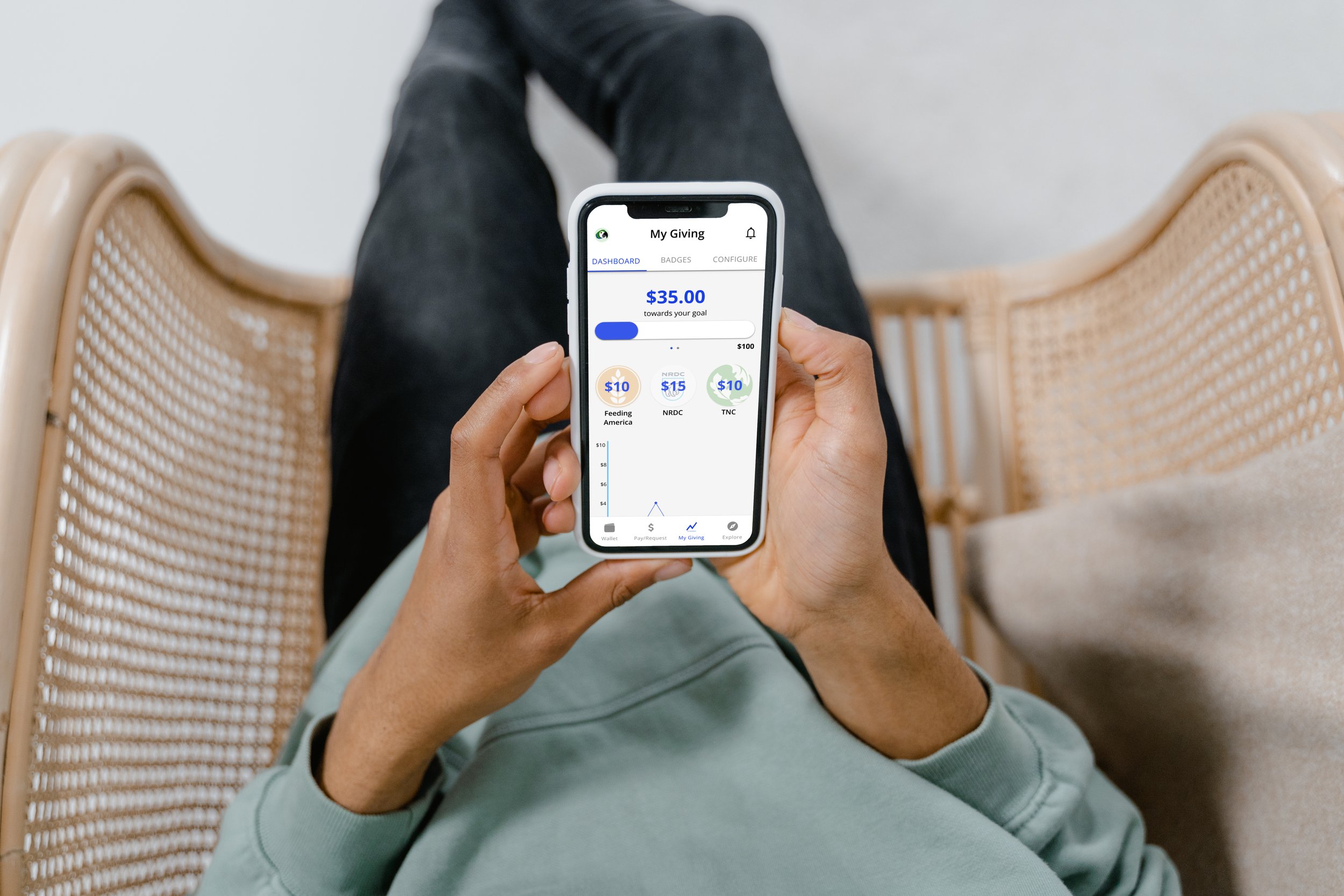
Determine whether the Transactions and Wallet features fulfill users’ core needs in a digital wallet
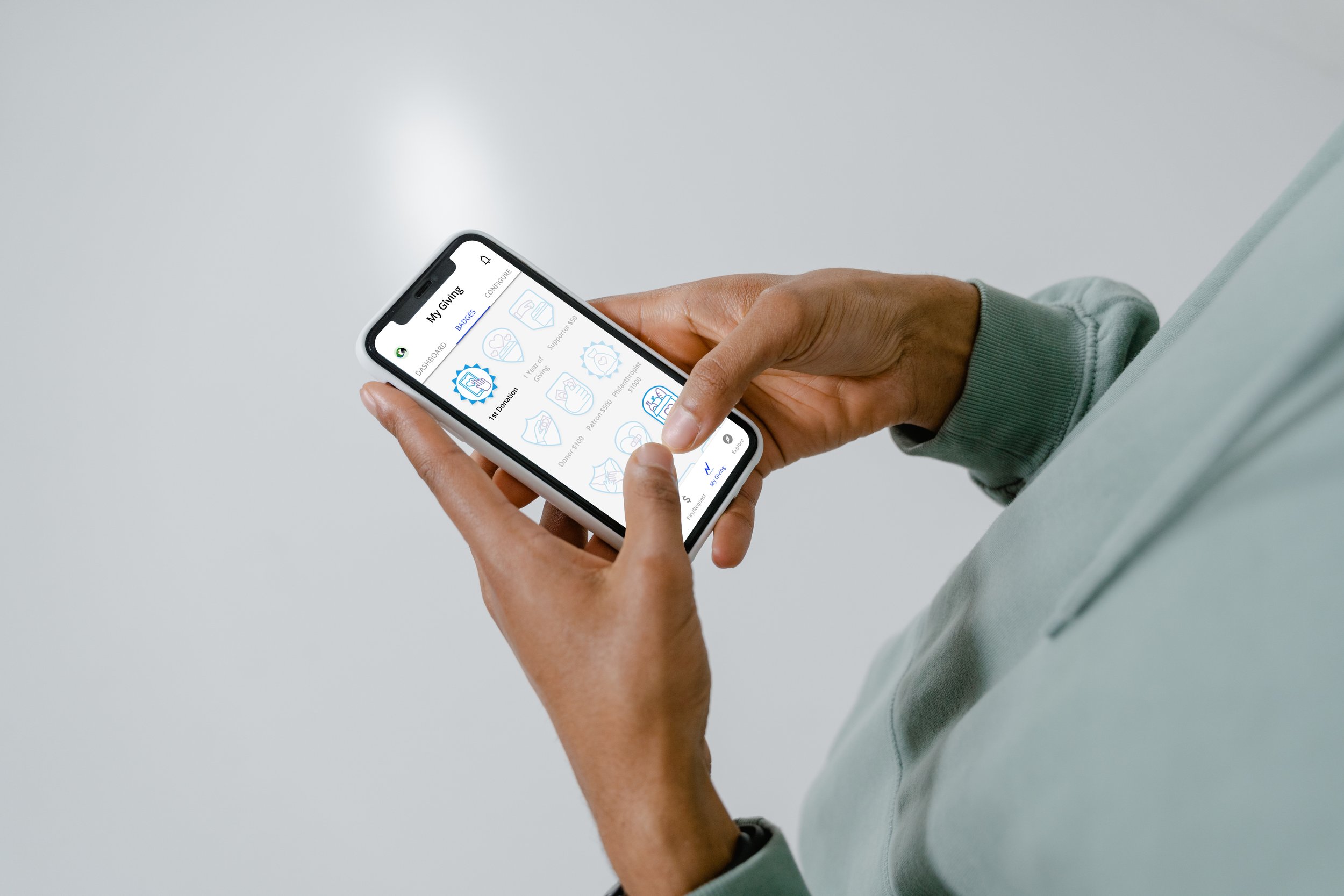
Observe how users set up and use the My Giving features (Configure, Dashboard, Badges)
I systematically analyzed the results to understand what design changes I needed to make

“This looks familiar in structure to other apps I’ve used.”
“I need to be able to set up multiple giving configurations at once.”
“I’ve never gotten into charitable giving because it can be such a pain, so I like that this leads me through the process.”
“I wish it were easier to change the charities I’m donating to after I set it up the first time.”
“I love the summaries. I love charts and percentages, I like to see a breakdown easily. I appreciate that those are upfront here.”
“I like that the color of the Macaw changes for different pages.. It’s fun and helps me see where I am in the app.”
“The order of navigation icons is confusing to me. There needs to be greater separation of banking from charitable giving functions.”
“If I’m buying 10 cups of coffee a week and rounding up on each, that’s a lot of receipts. I need a detailed way of accounting for my donations.”
Insights:
Users felt that the niche purpose of the app brought new and delightful value to their lives. The options for how to give appealed greatly to them.
The dual nature of the digital wallet and charity app still needed clarification. Users weren't sure if the primary purpose of the app was as a digital wallet or a charity app.
Missing selections during Configure disrupted the process.
Users felt that additional features typical of digital wallets were missing here (e.g., transaction history).
Subnavigation (skip, next, etc.) was confusing throughout the app.
Some users felt that Macaw needed more back-end accounting features in order for it to add significant value to users' lives. It’s not enough to help users donate, they also need help knowing what to do after the donation to take their giving to the next level (e.g., tax benefits).
06
Refine the design

After addressing usability issues, I ran preference tests to start developing the visual design
Test 1
Variables: (1) color scheme (yellow and light blue vs. dark and light blue) and (2) color design (vibrant color vs. white with color)
Results: Many users liked the vibrant color schemes, but the majority selected white/ blue because readability is best with this combo

Test 2
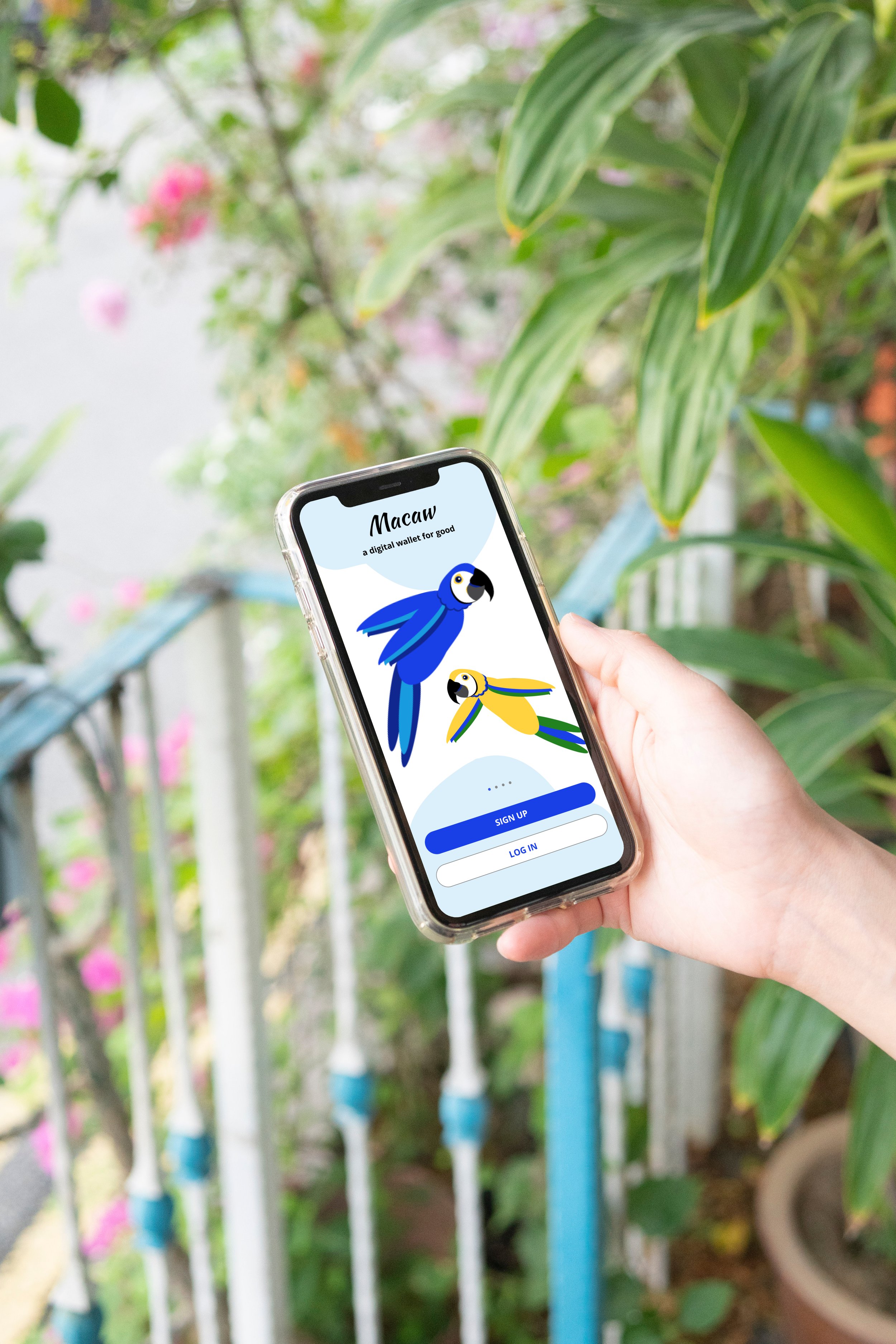
Variable: type of intro image (macaws to match the brand vs. a money/charity image to indicate app’s purpose)
Results: the on-brand image is catchier and brighter, creating more positive feelings; however, readability should be factored into the final image choice

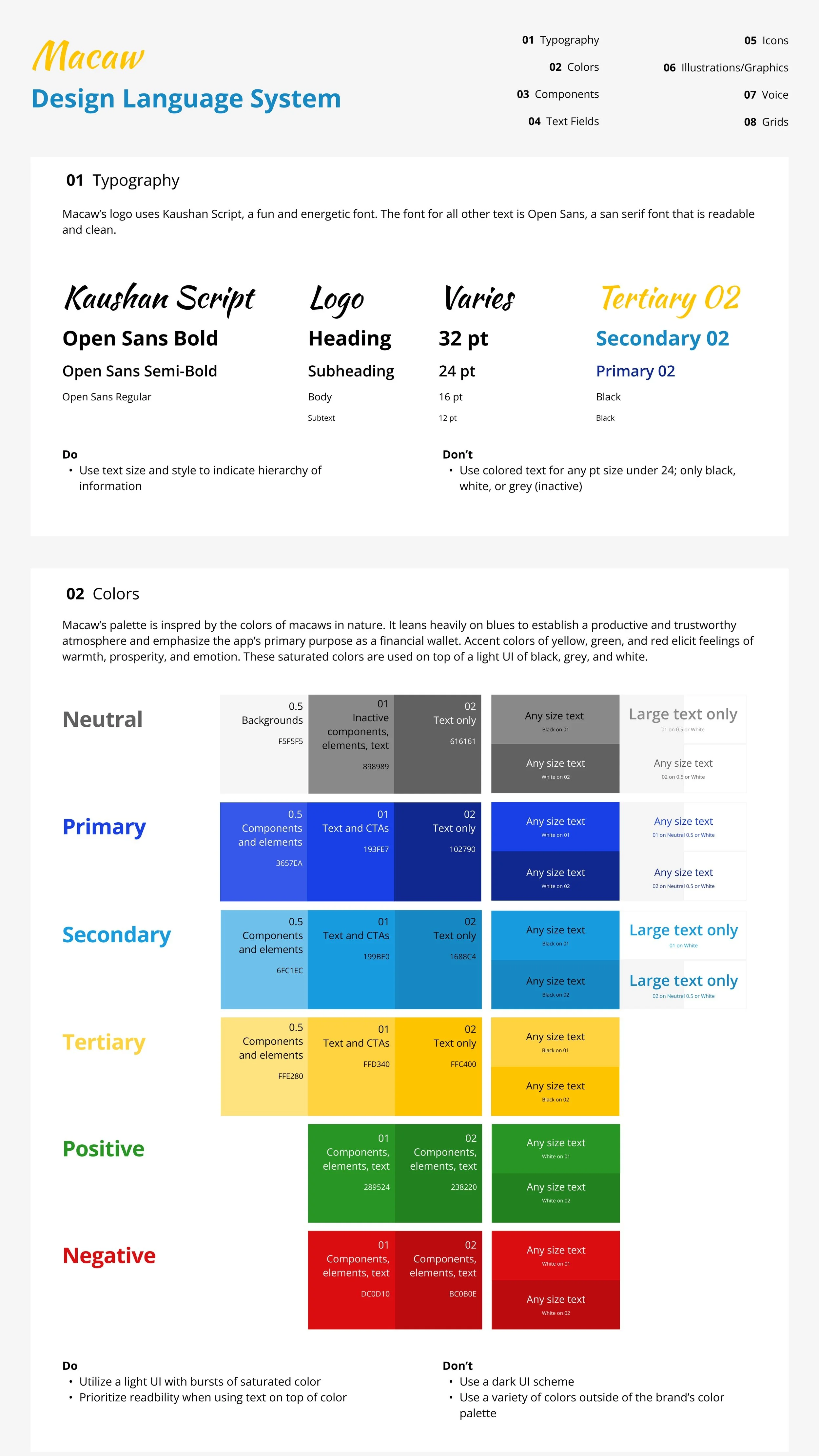
The palette leans heavily on blues to establish a productive and trustworthy atmosphere and emphasize the app’s primary purpose as a financial wallet
Accent colors of yellow, green, and red elicit feelings of warmth, prosperity, and emotion
I took inspiration from macaws in nature and based design decisions on color theory

I created an explanatory Style Guide and Design Language System encompassing typography, colors, UI elements, text fields, icons, illustrations*, brand voice, and more
*For this project, I created custom illustrations for Macaw’s brand


Finally, I used a high-fi prototype to solicit one more round of feedback from other UX and UI designers

Even at this late stage in the project, feedback helped me identify remaining weaknesses in the design. For example, I changed the onboarding from progressive coach marks to a carousel at sign up.
Other changes:
Added help icons to help clarify charitable giving-related jargon
Cleaned up color and typography to make everything more legible
Simplified the most info-dense and complex screens

07
Final product

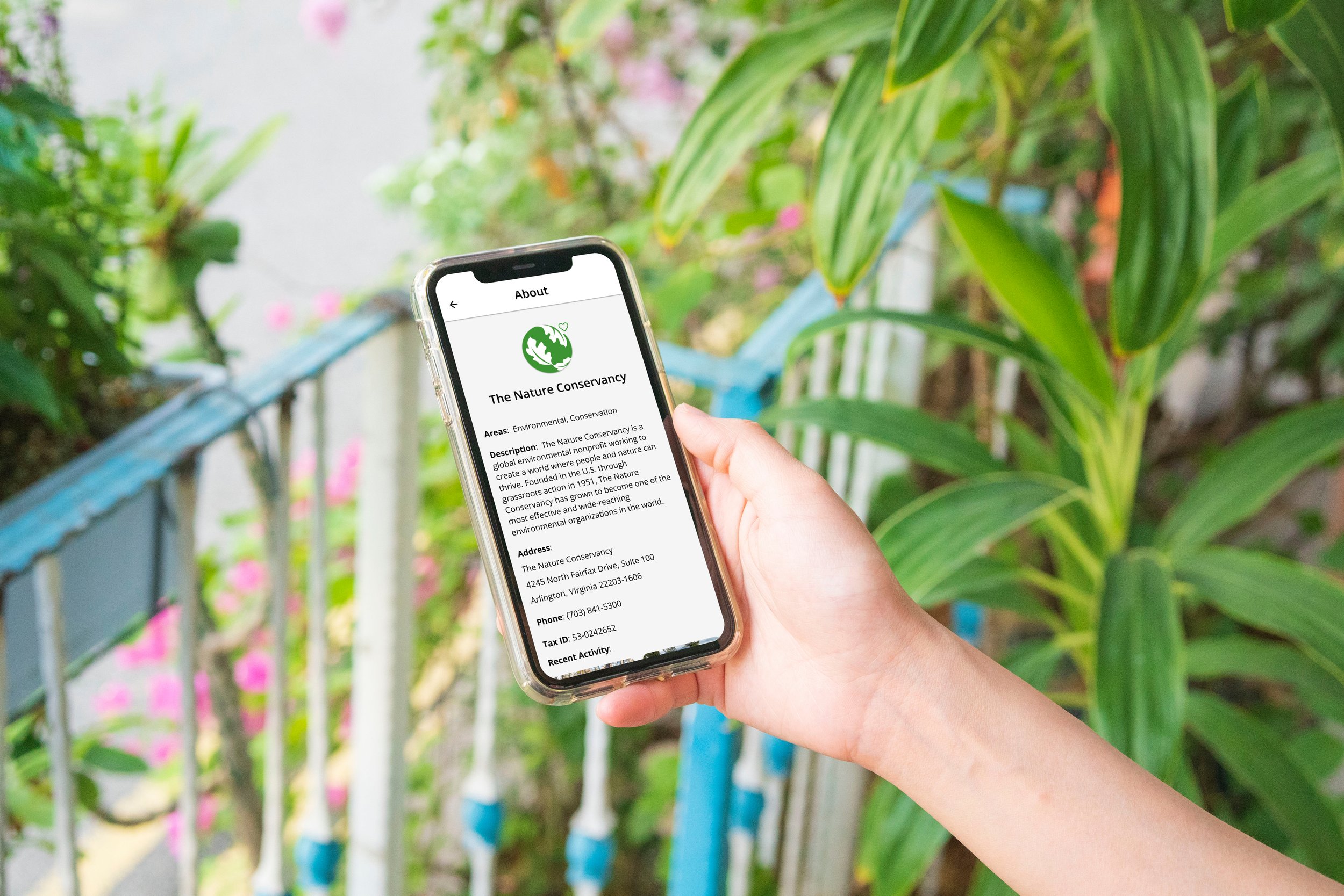
By the end of the project, I created a brand-new product in the digital wallet space. Macaw offers all the capabilities of a digital wallet that users are familiar with, but with the addition of specialized solutions to make charitable giving easy, realistic, and delightful. With time and resources to continue developing, the app has huge potential to impact users and the charities they support.
What did I learn?
Feedback, iterate, feedback, iterate, feedback, iterate
Document everything and keep files organized
UX is the underlying architecture and logic of a product, UI is the plaster and paint that makes it both beautiful and functional
Incorporate accessibility into your designs early on
What’s next?
Build out features that encourage users to engage more deeply with their charities, such as Explore, notifications, social sharing, campaigns, badge themes, trending fundraisers, and charity newsletters/updates
Conduct long-term data analysis and user research about giving and motivation
Flush out the back end (e.g., accounting, features for partner charities, etc.) to expand the app's functionality