Echo Website
🏅 Featured on Adobe’s Thinking Design blog
Timeline
April-May 2022
Tools
Adobe XD, Miro
My Role
UX Researcher, UX Designer, UI Designer, UX Writer
Design Thinking, UX Research, Stakeholder Interviews, Competitive Analysis, Proto-Personas, Ideation, Site Maps, Wireframing & Prototyping, Moodboards, UI Design, Usability Testing, Affinity Mapping, UX Writing, Copywriting
Skills
Client
RCA Records, of Sony Music, is the second-oldest record label in American history. It has released multiple genres of music, including pop, classical, rock, hip hop, afrobeat, electronic, R&B, blues, jazz, and country. The RCA catalogue includes records by influential artists such as Elvis Presley, Nina Simone, and ABBA. As of 2021, the label's roster included Chris Brown, Miley Cyrus, Doja Cat, Alicia Keys, and many more.
Project
RCA Records needed a website for up-and-coming artist Echo.* With a single and album about to drop, the label was looking for a (quick!) solution to help them share Echo with the world. To meet this goal, I researched, designed, and tested a website that represents the artist’s brand and achieves the label’s goals.
*Echo is not a real artist. This was a real-world inspired project, with real-world business constraints, conducted in partnership with RCA Records.

01
Define the problem
02
Ideate Solutions
03
Create prototype
04
Evaluate design
05
Final product
Define the problem
01

I held a stakeholder interview to understand the business strategy
We defined the business goals as:
Push Echo’s music via pre-saves and pre-orders
Push discovery via an engaging bio and content

I conducted a competitive analysis to understand existing solutions

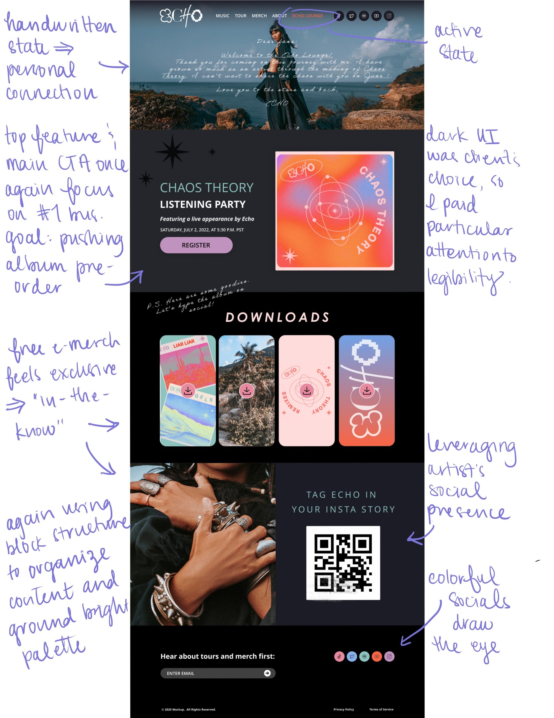
The strongest designs used organized navigation and block formats to ground bold colors, graphics, and heavy text.
The weakest designs had unintuitive navigation, creative but confusing interfaces, overwhelming visual design, and illegible text.
I developed a proto-persona to understand Echo’s fans.

Since time and resources didn’t allow for a survey or interviews at this stage, I worked with information RCA already knows about music fans.
Ideate solutions
02

I brainstormed features to connect fans to Echo’s story and the album’s success
My ideas
Easter eggs (e.g., stars from album artwork)
Branded screen savers, wallpapers, banners
Insta/Snap filter with music
Listening party
Fan badge
Client parameters
No one-time pop-ups and feeds of social posts
Use a dark UI
Use Smartlinks that are easily updated
Focus on high-impact, low-effort features, because of the time constraints and bandwidth of RCA’s Dev team
I sketched a rough site map

Then I created mid-fi wireframes to lay it all out

Create prototype
03
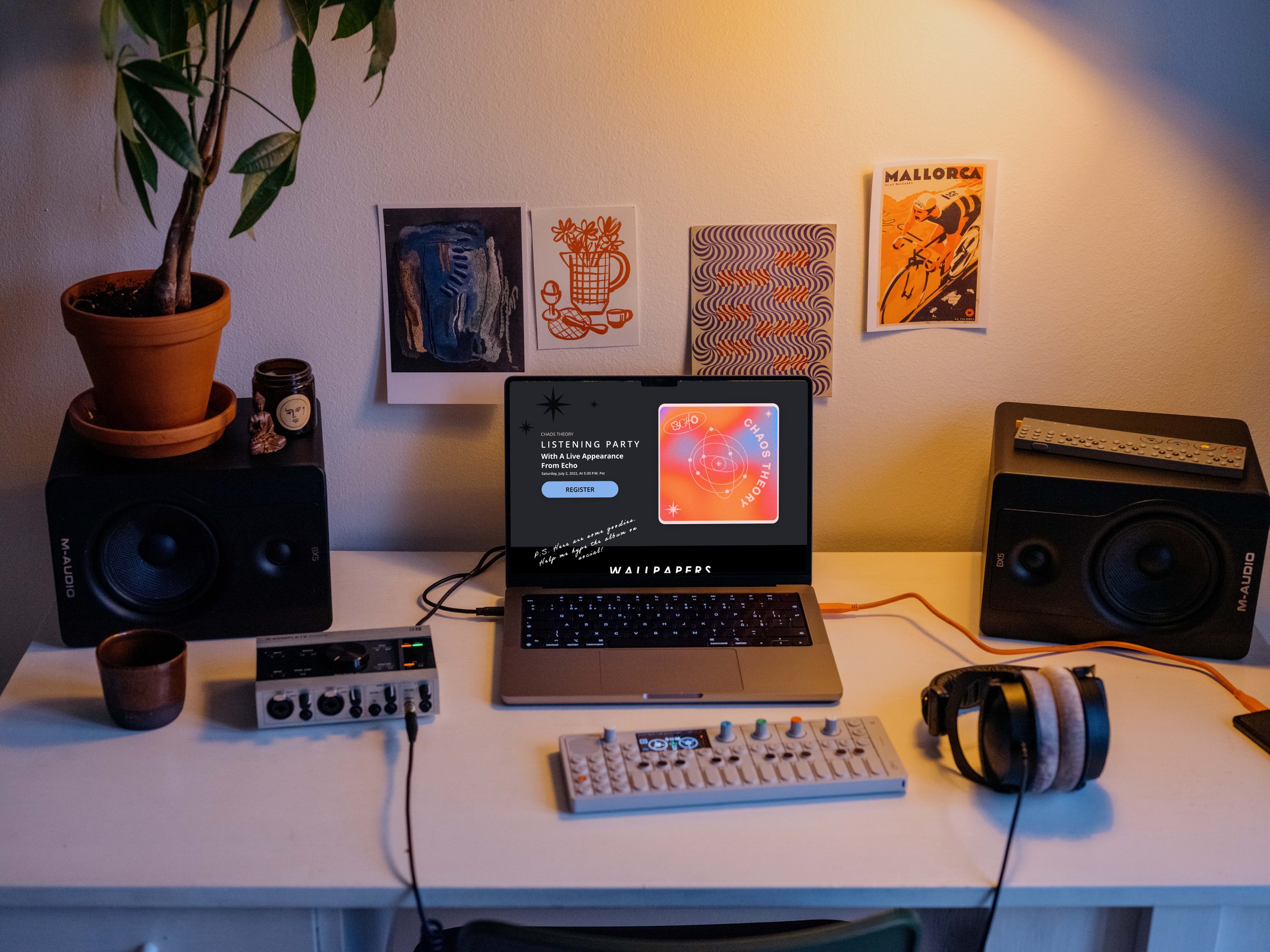
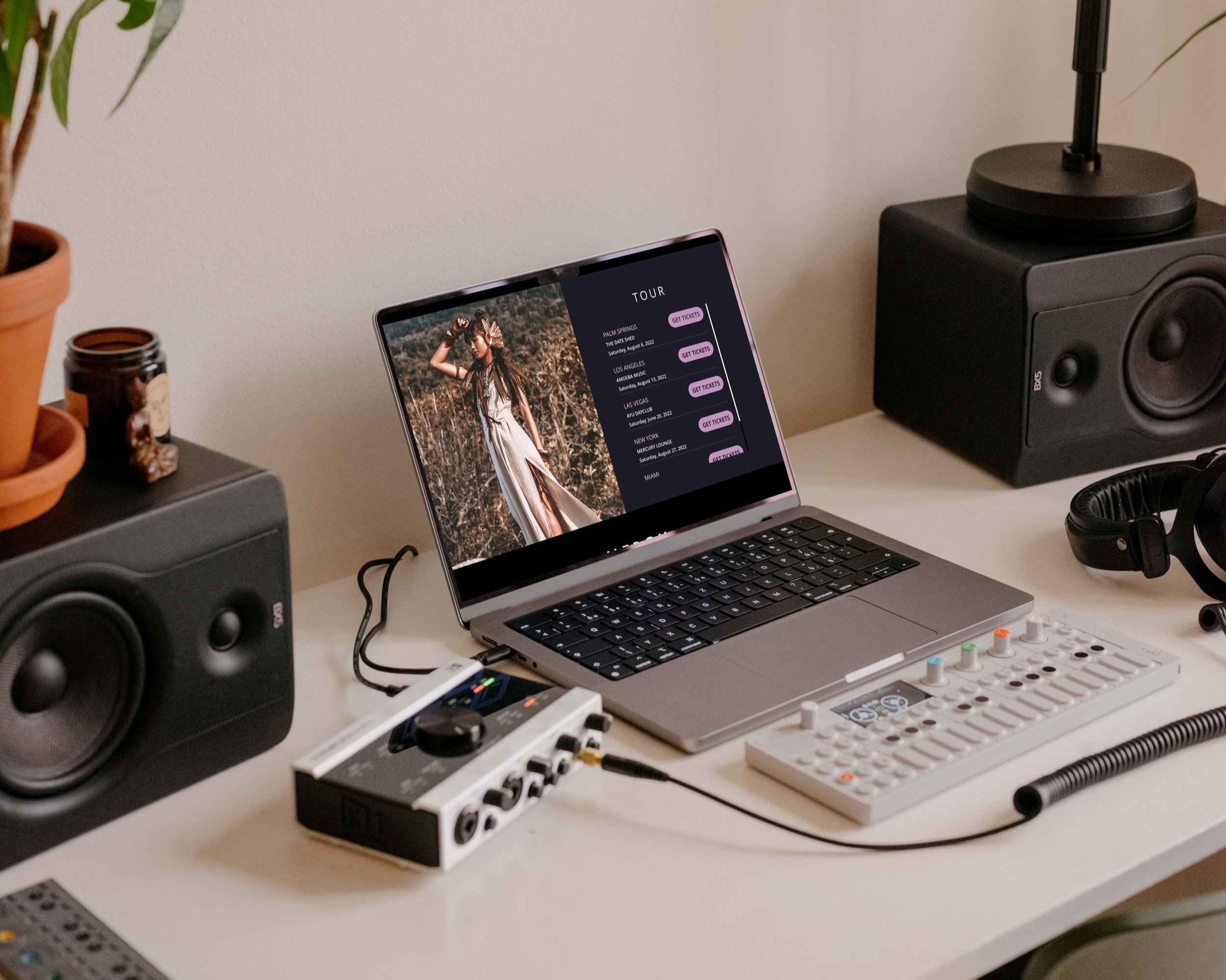
I designed a high-fidelity prototype using Adobe XD


I also created a moodboard to align the visual design with Echo’s brand
I listened to the Chaos Theory playlist on repeat while working

04
Evaluate design

I used the prototype to test the design with users
Participants: 3 women in the target demographic (15-35 years old) who visit artist websites a few times per year
Format: 30-60 minute interviews in-person and via Zoom
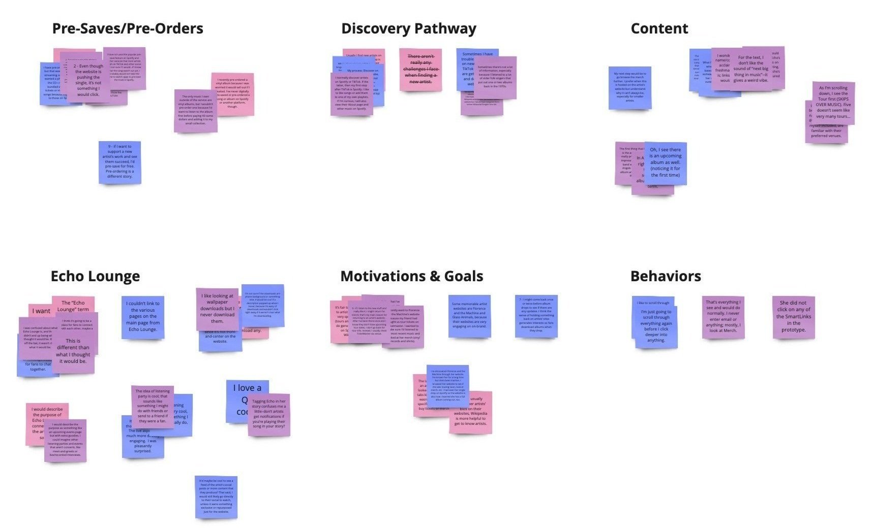

I discovered insights that conflicted with RCA’s business goals
Most users do not pre-save or pre-order music
Most don’t know what pre-save means (“Do I have to pay?” “How does that work?”), some don’t want their music listening behaviors disrupted, and others don’t want to spend extra clicks or money on an unfamiliar artist
Most users do discovery elsewhere
They often start on Spotify and social, then move to Google, and visit the artist’s website last to check tour info and browse merch
With this feedback, I iterated the design to reconcile business goals and user needs and fix usability issues


05
Final product

In the end, I provided RCA Records with an MVP of an artist website that is ready to launch ASAP, pushes pre-saves and pre-orders (per business goals), and makes information about tours and merch easy to find (per user needs).
Most importantly, I created a solution for fans to connect more deeply with Echo—a goal that the business and users ultimately had in common.
What did I learn?
Business goals and user needs often conflict, so the designer must find solutions to bring them together
It is very important to conduct user interviews and surveys early in the design process, time and resources-allowing
The balance between strong UX design and creative visual design can be delicate
What’s next?
Consider solutions to educate users about pre-saving and integrate with Spotify
Add even more behind-the-scenes content that is not on social or Spotify, to draw in users that do discovery elsewhere
Design a mobile version